|
Supporting
Brand Elements
Introduction
If our brand is a promise — the promise to uphold our core
values — then a consistent “look and feel” serve
as the tangible symbols of that promise. Beyond Jeeves, our logotype
and the Ask button, our brand is supported by the typography, images
and colors that we traditionally use. This
section outlines the supporting elements that make up the crucial
infrastructure of the Ask Jeeves brand.
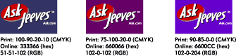
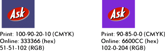
Color
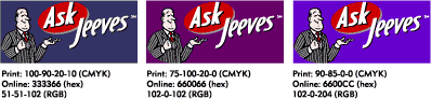
Color is a key element in establishing
a brand. For example, when most people see the red of a Coca-Cola
can or the yellow of a Kodak box, they automatically associate the
color with a brand. Consistent representation of our brand colors
will, over time, create a similar brand preference for Ask Jeeves.
The various Ask Jeeves color palettes work together to create specific
effects and have been chosen carefully. Use no more than four colors
from any one palette in any design.
Typography
Metro and Electra are the standard typefaces
for use on all Ask Jeeves publications and products, whether online
or in print. A brief description of each font and its proper usage
follows.
Online vs. Print
Online typefaces depend on the fonts
already installed on a user’s computer. Nearly all personal
computers have Times Roman, Arial/Helvetica, Courier, Verdana,
Georgia, Trebuchet and MS Comic Sans.
Any other fonts, including Metro and Electra, have to be made
into GIF files and placed on a Web page as a graphic. This type
of font use is often referred to as “GIF type.”
Because presenting GIF type for all text is impractical, pre-installed
fonts are used most of the time. GIF type, therefore, is used
for accent, labeling, headlines and display.
Computer monitors use extremely low resolution, around 72 dpi,
which makes online text less legible than print. Smaller font
sizes are especially likely to become unreadable online.
Anti-aliasing is often desirable when creating GIF type, which
makes it even less readable at smaller sizes. To ensure legibility
online, installed computer fonts must be larger than for print,
and GIF type must be even larger.
Resources
Although the Ask Jeeves font palette
uses some of the best type design available, a font by itself
doesn’t automatically produce good typography. There are
several excellent books on typography, such as The Elements
of Typographic Style by Robert Bringhurst.
Also, if you live in the San Francisco Bay Area, a class called
“Typography and Typographic Design,” taught by Alistair
Johnston at the University of California, Berkeley Extension,
is one of the best available.
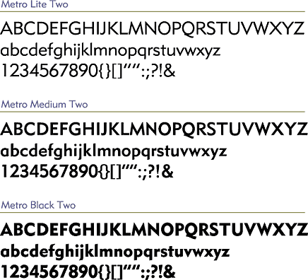
Metro
Linotype Metro Two (Lite, Medium,
Black)
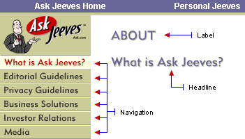
Use Metro for navigation, labeling, headlines
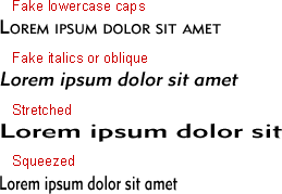
and display. Let the font be the font. Except for isolated instances
approved by Ask Jeeves, Metro should not be manipulated, such
as by using fake lowercase caps, height and width distortion,
or fake italics or oblique.
Metro was chosen for its flexibility. It can be used for stylized
display and for highly utilitarian uses, such as navigation labeling
and readable text. It maintains a quiet elegance and legibility
at both small and large sizes across print, broadcast, and online
media.
Metro reflects the style of the 1920s and 1930s without being
overdone, and it works well in contemporary design settings. The
three weights offer a good range of color for the Jeeves design
strategy.
Typeface Do’s and Don’Ts
In addition to the general graphics guidelines, the following
examples demonstrate some do’s and don’Ts:
Do:
Don’t:
Also review the general guidelines found
in General Do’s and Don’ts
Metro’s History
 |
|
 |
Designed by William Addison Dwiggins between 1929
and 1930, Metro was used for display and short text passages
for magazine and newspaper ads.
In creating Metro, Dwiggins was influenced Edward Johnston’s famous 1920s typeface, London Underground, which was used by the London Underground transit system for signs, maps and printed ephemera, such as train schedules. Another likely influence on Dwiggin’s Metro was Eric Gill’s typeface, Gill Sans.
|
 |
|
 |
Online
Minimum type size
Upper and lowercase: no less than 11
points
All caps: no less than 10 points
Letterspacing
All caps: When using all caps at 12 points
and above it is often not necessary to add letterspacing (or use
very little of it) to increase legibility. Below 12 points, or
whenever necessary, use only enough letterspacing to make the
text legible.
Lowercase: Lowercase letterspacing can be used for Web work to
improve legibility.
Print
Minimum type size
Upper and lowercase: no less than 6 points
All caps: no less than 5 points
Letterspacing
All caps: Use letterspacing only when
necessary to increase legibility.
Lowercase: Lowercase letterspacing is not to be used either for
print or for effect.
Licensing Logistics
The Metro Two (Lite, Medium and Black)
family of fonts can be purchased directly through the Linotype
foundry: http://www.linotypelibrary.com.
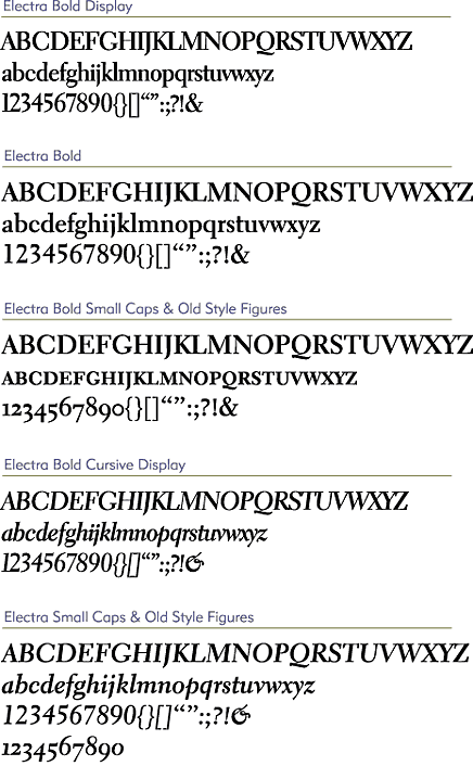
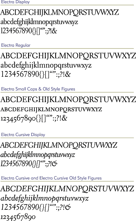
Electra
Linotype Electra 1 & 2 (all styles)
Use Electra for display that requires serif
type. Use display instances wherever possible (i.e., where the display
text will be legible). Also use Electra for text type in printed
materials.
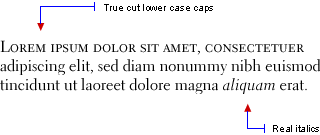
We have chosen Electra because as a text type it provides excellent
legibility at small sizes on the Web (GIF type). Its family offers
a wide array: true-cut lowercase caps, old style figures, perfectly
kerned display fonts, plus regular, italic, bold and bold italic.
In both text and display usage, Electra maintains its warmth, elegance
and functionality.
Let the font be the font. The display fonts should be no smaller
than 14 points and rarely need kerning. (If in doubt, don't kern.)
Except for isolated instances approved by Ask Jeeves by contacting
brand@askjeeves.com, Electra
should not be manipulated, such as by using fake lowercase caps,
height and width distortion, or fake italics or oblique.
Typeface Do’s and Don’ts
In addition to the general graphics guidelines,
the following examples demonstrate some do's and don'ts:
Do:
Don’t:
Also review the general guidelines found
in General Do’s and Don’ts
Electra's History
| |
|
|
Designed in 1935 by
William Addison Dwiggins, Electra is a classic book typeface.
The following is quoted from Adobe's Web site:
In the specimen book for Electra, Dwiggins himself points
out the type’s identifying characteristics:
“The weighted top
serifs of the straight letters of the lowercase: that
is a thing that occurs when you are making formal letters
with a pen, writing quickly. And the flat way the curves
get away from the straight stems: that is a speed product.”
Electra is not only a fine text
face but it is equally responsive when set at display
sizes, realizing Dwiggins’ intent when he set about
the design:
“...if you don’t
get your type warm it will be just a smooth, commonplace,
third-rate piece of good machine technique — no
use at all for setting down warm human ideas —
just a box full of rivets.... I’d like to make
it warm — so full of blood and personality that
it would jump at you.”
|
|
|
|
Online
Minimum type size
Display: 18 points
Regular: 16 points
Letterspacing
All caps: For text, use true-cut lowercase caps with the default
letterspacing. For headlines and titles, expand the letterspacing
to increase legibility.
Lowercase: Lowercase letterspacing can be used for Web work to
improve legibility.
Print
Minimum type size
Display: 14 points
Regular: 6 points
Letterspacing
All caps: For text, use true-cut lowercase caps with the default
letterspacing. For headlines and titles, expand the letterspacing
to increase legibility.
Lowercase: It is not to be used for print. Do not use letterspacing
on lowercase letters for effect.
Licensing Logistics
The Metro 2 (Light, Medium, and Black) family of fonts can be
purchased directly through the Linotype foundry: http://www.adobe.com
or http://www.linotypelibrary.com.
Licensing Logistics
Metro Two (Lite, Medium and Black) as well as the Electra family
of fonts can be purchased directly through the Linotype foundry:
http://www.linotypelibrary.com.
The Electra family of fonts can also
be purchased from Adobe:
http://www.adobe.com.
|